Dark Mode
Alteryx Dark Mode
Alteryx Designer is a professional analytic software platform.
As I was using Alteryx Designer, one thing I noticed was it didn’t have a Dark Mode, which is becoming the standard for professional applications people use all day. Adobe, Autodesk, SolidWorks, and even Microsoft Office all have Dark Mode options.
A quick google search showed that I was not alone in wanting this feature, people had been requesting it for some time.
https://projects.invisionapp.com/prototype/Alteryx-Nightmode-ck80ttjjh004cq301f971k5bb/play/408c4add
As a personal project, I created a dark mode for the Alteryx Designer platform.
Using Photoshop for quick color manipulation, I mocked up a quick Invision prototype of what this Dark Mode could potentially look like.
I kept the icon colors as close to the original as possible, while still being legible.
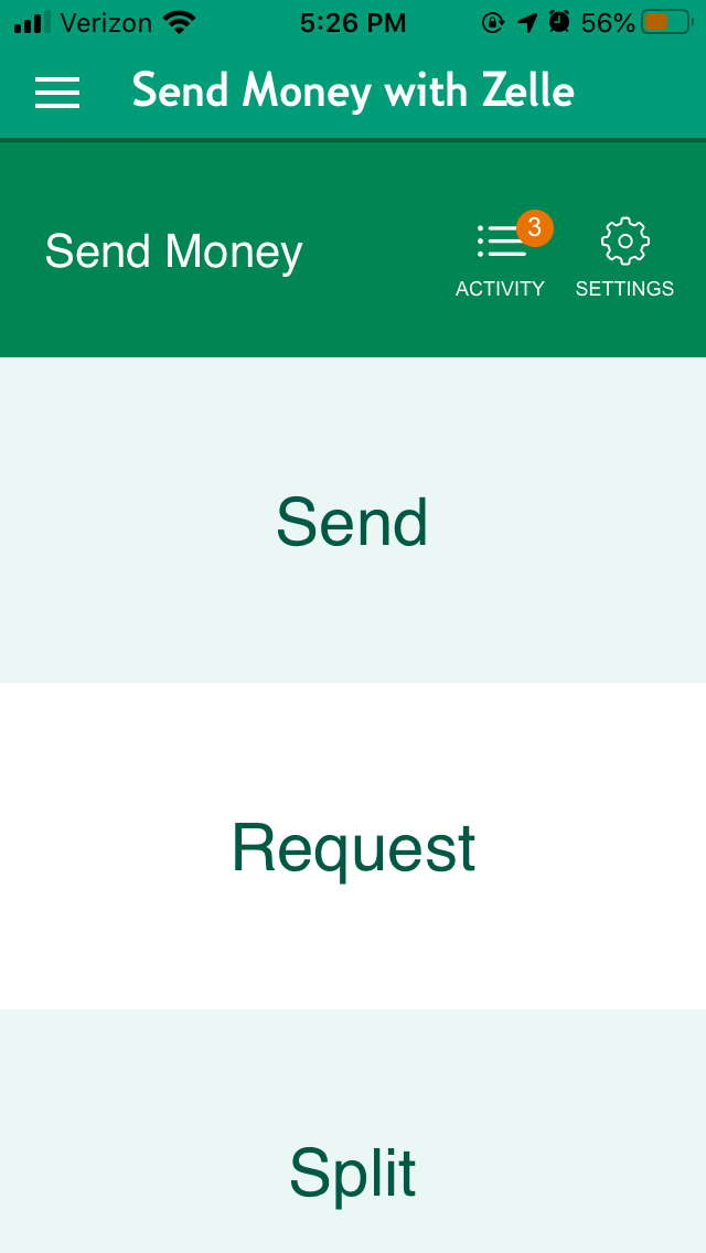
Citizens Bank
One of my good friends has an account at Citizens Bank and always has his phone in dark mode. He mentioned to me it was frustrating that this pairing doesn’t work well, the Citizens Bank app is always dominated by white. So I created an example of how this could be fixed.
Using Photoshop for quick color manipulation, I mocked up a quick Invision prototype of what this Dark Mode could potentially look like.
Dark Mode Screens
Original Screens
Liberty Mutual
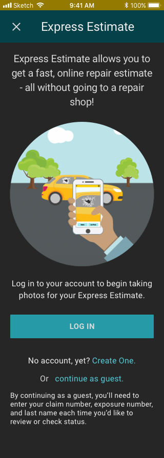
As a personal design exercise, I designed a dark mode for the Liberty Mutual app. The current app only has a light mode, which doesn’t work as well at night when the phone operating system and other apps switch to a dark mode.
I created a new app in Sketch, recreating all of the assets. Then I used Invision to make a mockup prototype.


