Vostlens - AR Glasses
This August 2018 project was an imagination of the realization of the Intel Vaunt technology. I created a smart-glasses interface and iPhone settings app.
Great minds think alike, since after I finished the project Focals by North came out with similar styling and ideas.
Problem
Current modes of communication are not conducive to an “on-the-go” environment.
Smartphones can give you calendar updates, and messages, but only if you pull out your phone, unlock it, and interact with it, requiring at least one hand to operate.
Smart-watches are better, they can give you updates without requiring an unlocking procedure, but still are not subtle enough.
Audio notifications have potential in the future, but it is not currently socially acceptable to wear an earpiece or headphones all day, while interacting with others.
Glasses had the most potential give unobtrusive notifications but current iterations, such as google's, were too obtrusive and not socially acceptable due to their camera and styling. I wanted to fix this.
Goal - Who is the initial target audience?
Busy Sales Professional
Need to be connected
Can’t break social norms by checking their phone or watch
Stay connected inconspicuously
Current Market
Smartphone
Smart-watch
Audio Earpiece
Design Constraints
I wanted to pair the technology and design. Google glasses was a flop because it forgot about the society it was living in. Tech and design were equally important for success.
I wanted to create a technically achievable design, so I searched to look at the current technical market and limitations to give the design some guides.
Intel created Vaunt laser technology.
safe low powered laser to project a screen into your eye when glancing down to the right at it
red, monochrome 400 x 150 pixel interface
This would be the perfect starting point, as though it was not commercially successful, the technology was proven to work.
Minimum Style Specs
Stylish
Inconspicuous
“Hipster Chic”
Minimum Tech Specs
18 hour battery
Display messages
50g weight max
Persona - Steve
Demographics:
30 years old
Single
Busy working professional
Environment:
San Francisco
Profession: Lead Sales Rep for the West Coast Area
Tech Savvy
Goals:
Technology to accommodate both his professional and personal life
Save time
Receive information without being distracted
Tasks/Responsibilities:
Lives off his iPhone and laptop
Must be up to date on the latest news
Constantly receiving messages
Always on the go
Physical Glasses
I had to design physical glasses that were able to fit these characteristics. I sketched front and side glasses profiles as a starting point.
I created a CAD model of the glasses to get more exact dimensions and for manufacturing.
I created a looks like model from acrylic and black electrical tape. This had the minimalist style I was going for, and exactly the right size.
I also created a CAD render for marketing and design purposes.
The final glasses are fairly stylish given the design constraints. The side pieces are thicker than I would like, but that is the trade-off needed to give room for the electronic components. The flowing sweeping sides hide the electrical components well, making it look purposeful and stylish instead of a cyborg add-on.
Glasses App - Paper
I needed to create the interface that went onto the glasses to show notification messages.
The first iteration was a good start, but had some problems. Since you could only have a limited amount of information on one screen, some notifications needed multiple parts but this was not readily shown. If you were busy or turned off your phone, when you went back to the notifications there would be many stacked up, but not indication of how many.
Glasses App - Digital
I tried to solve those problems with higher fidelity sketching. When I made the iterations, I was sure to play with them behind a blurry environmental background, similar to the actual application. Dealing with transparency was important as the technology cannot produce white or black, only red.
Glasses App - Anatomy of a Message
The framework for the final version included all the needed information in an organized fashion. This allows any application to automatically function based on current iPhone notifications.
Phone App - Paper
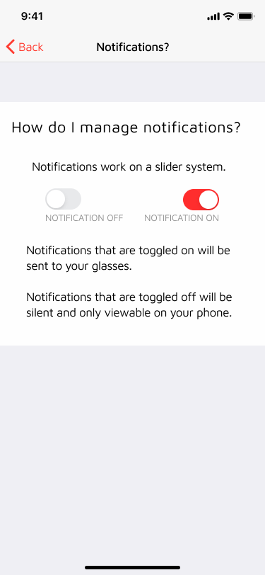
I needed an app to sync the messages to the glasses. Which message get sent to the glasses is an important consideration, as it must be useful without being overwhelming.
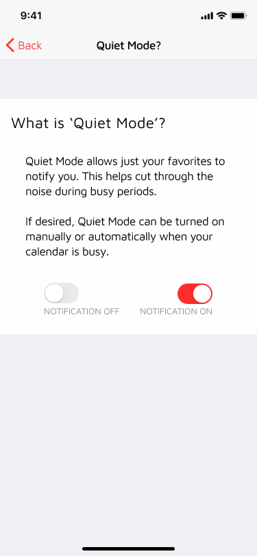
I created a “Quiet Mode” setting that allowed an extra select group of messages through. This mode could be turned on manually or automatically when the calendar is busy. For example, with this mode, you could still receive text messages but not ESPN Sports updates.
Phone App - Final
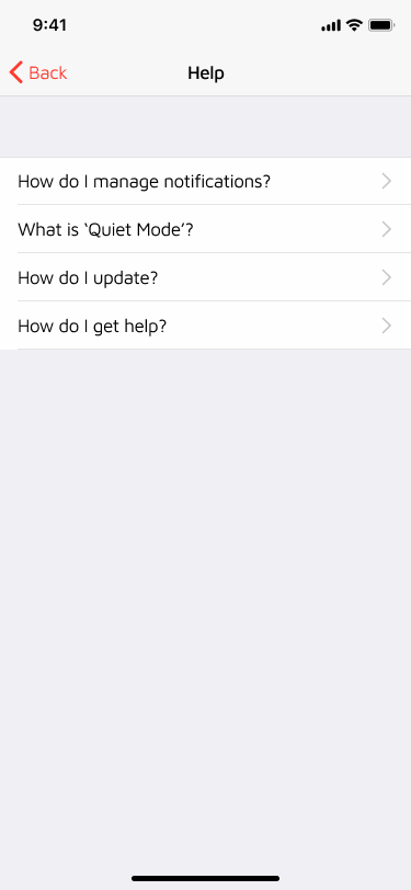
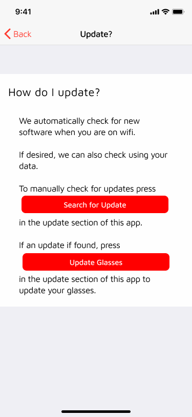
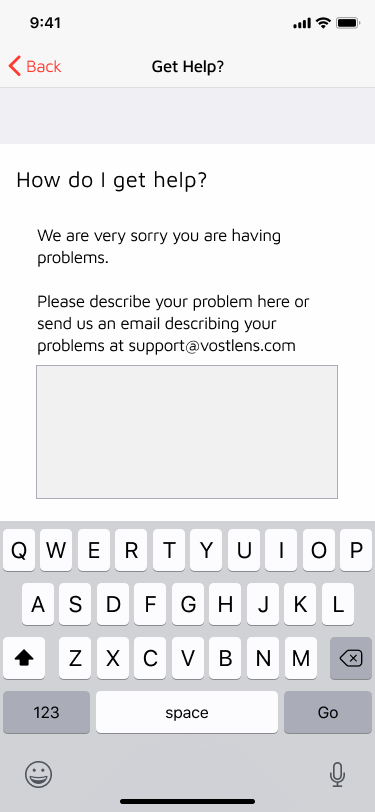
I created the final app screens in Figma with iPhone X styling. I created a clickable prototype which is embedded above, along with the individual screens.


